External Forms
Whether you’re collecting leads, accepting job applications, or any other process that requires filling in some data, External forms got your back.
Transcript
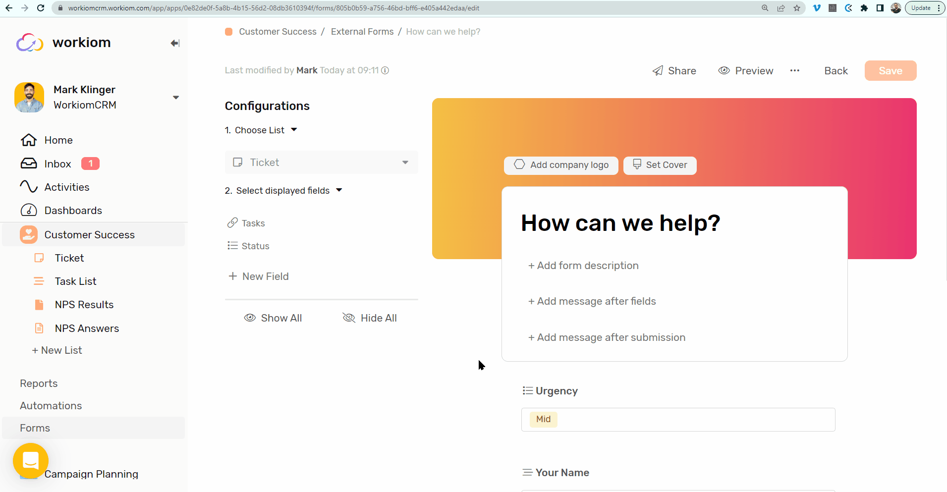
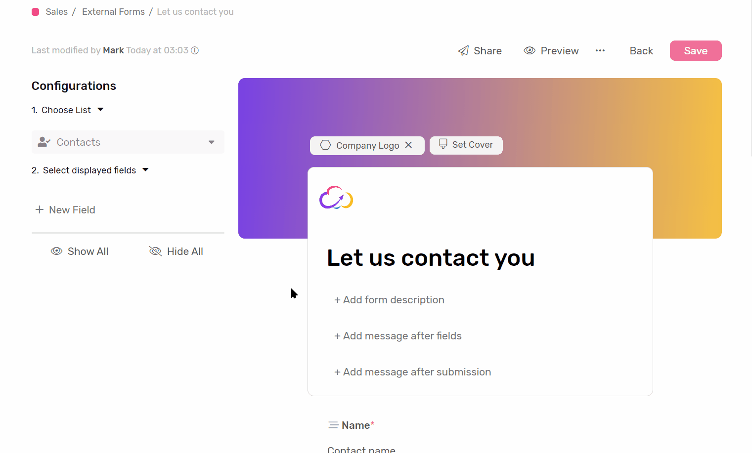
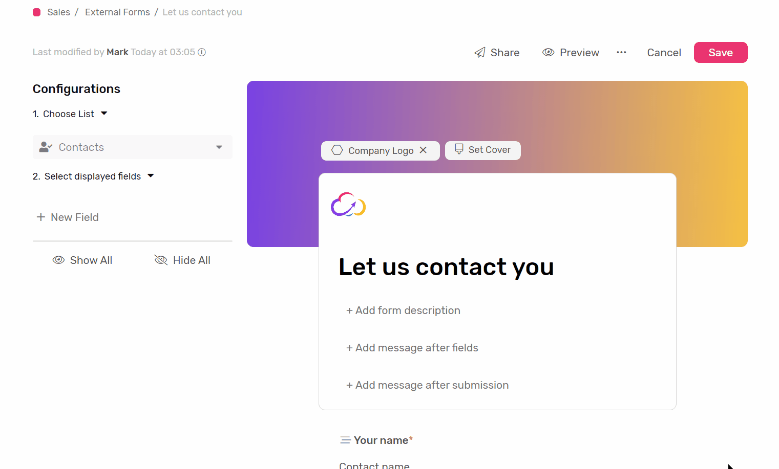
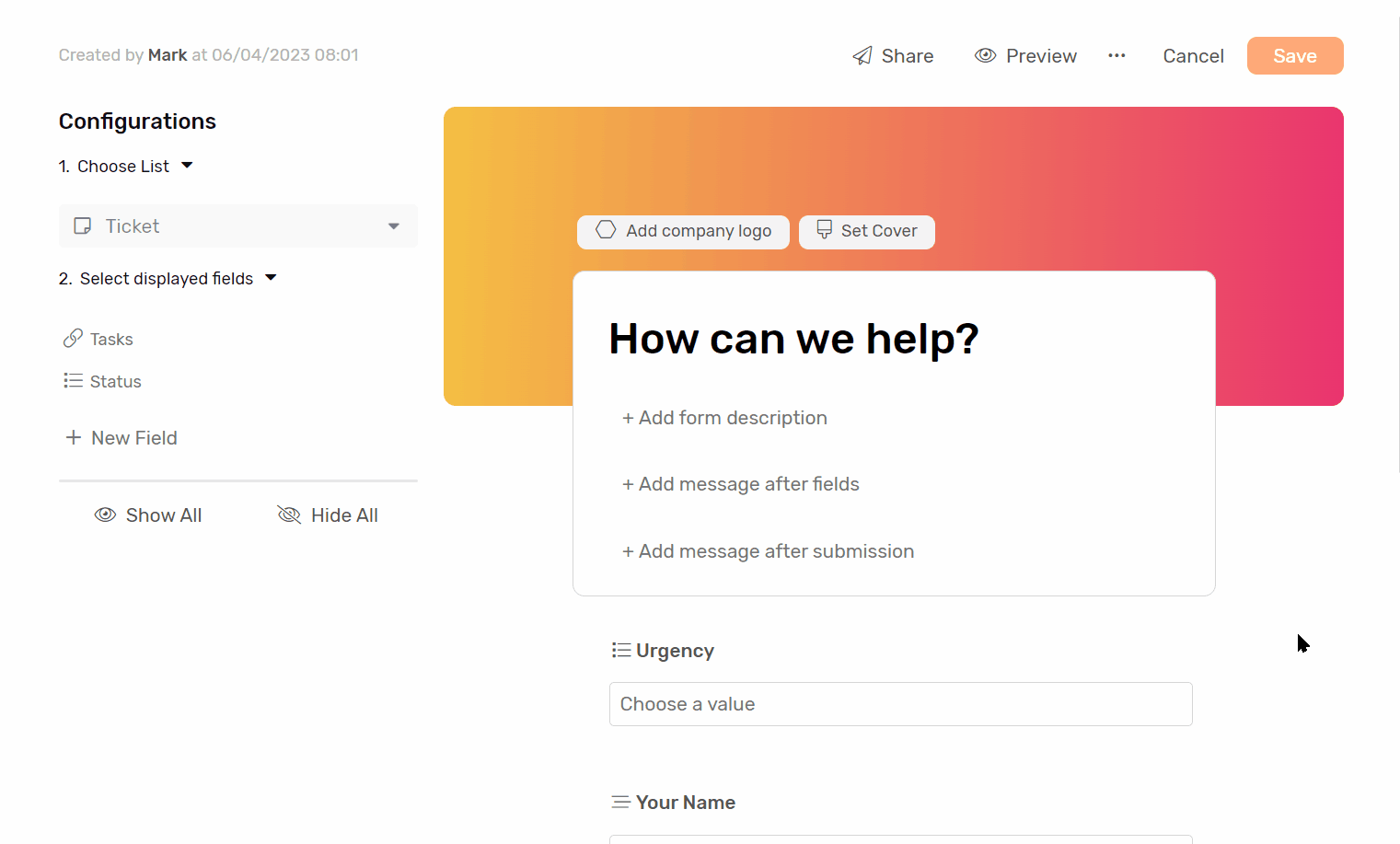
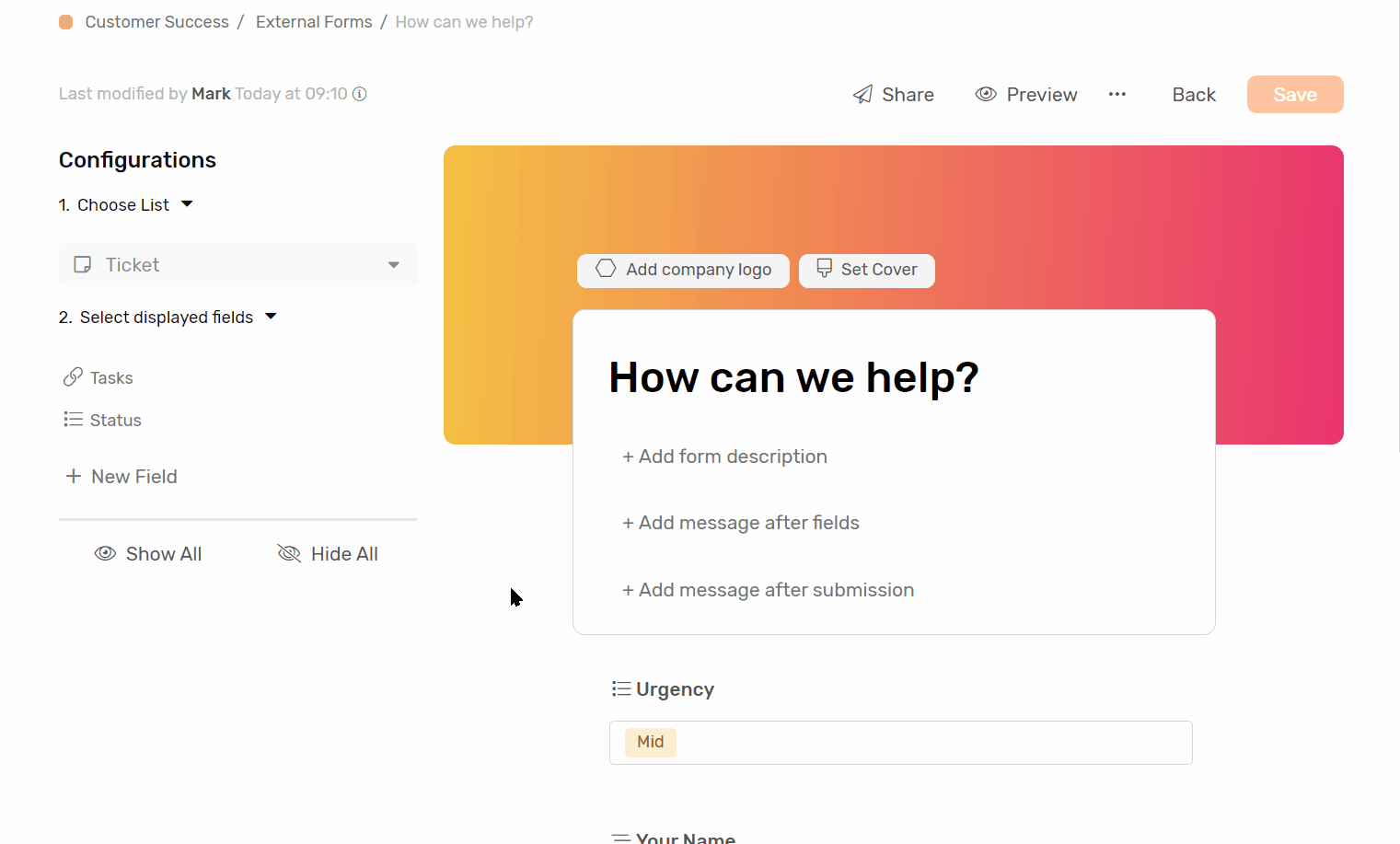
Creating an External Form
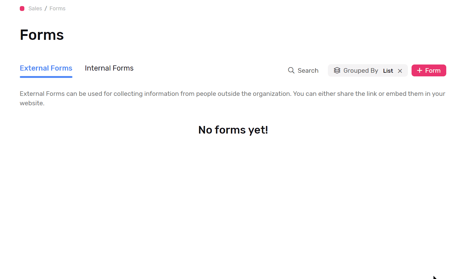
- Under any app go to Forms
- Click External Forms
- Click + Form button, and you will be redirected to the form creation page.
- Choose the list you’d like to create the form for.
- Customize your form.
- You can preview it with the preview button.
- Click save and you’re done.
Form Customization
Branding
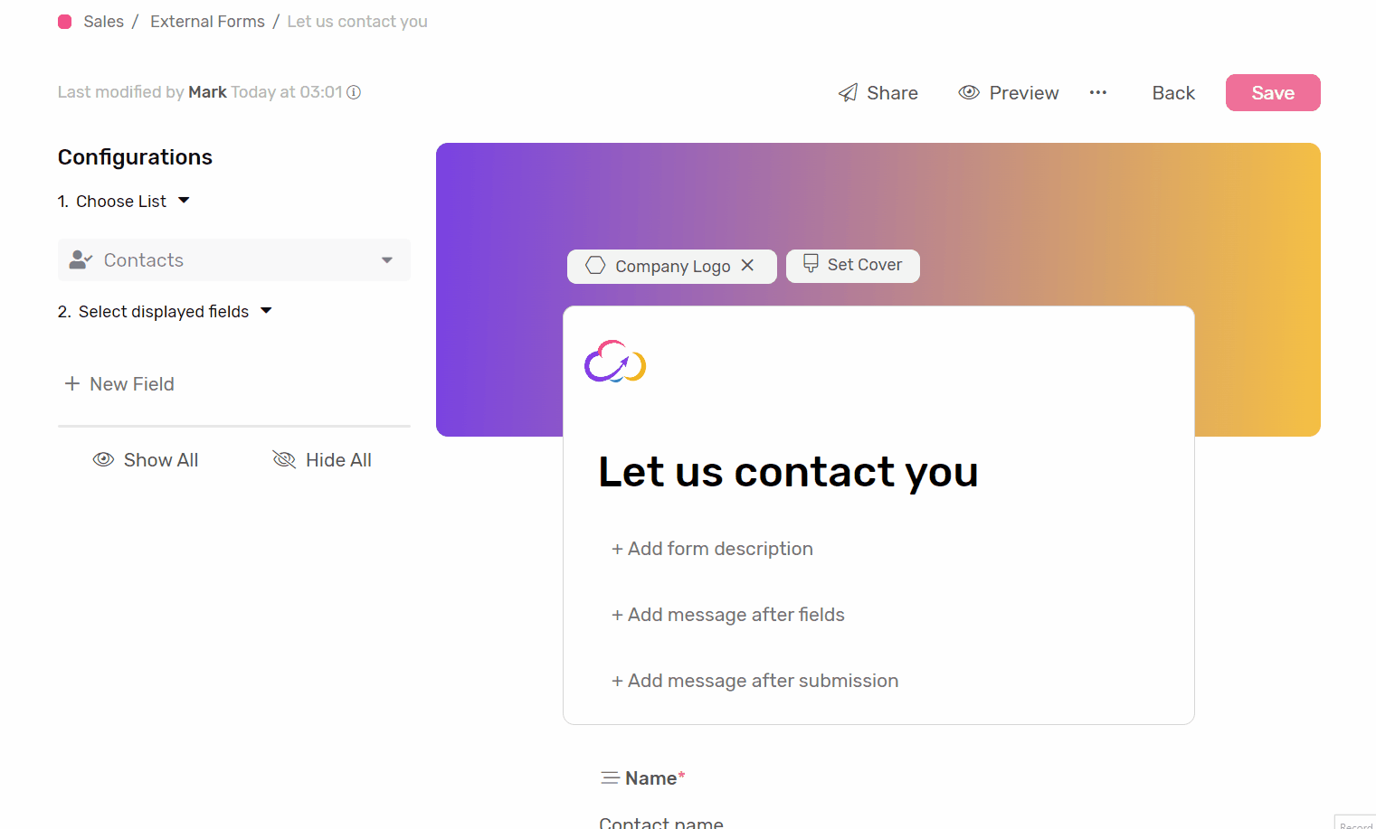
- Logo: You can add a logo to your form to emphasize your corporate identity.
- Cover: You can further show your identity by adding a cover image, or create a gradient with the colors provided.
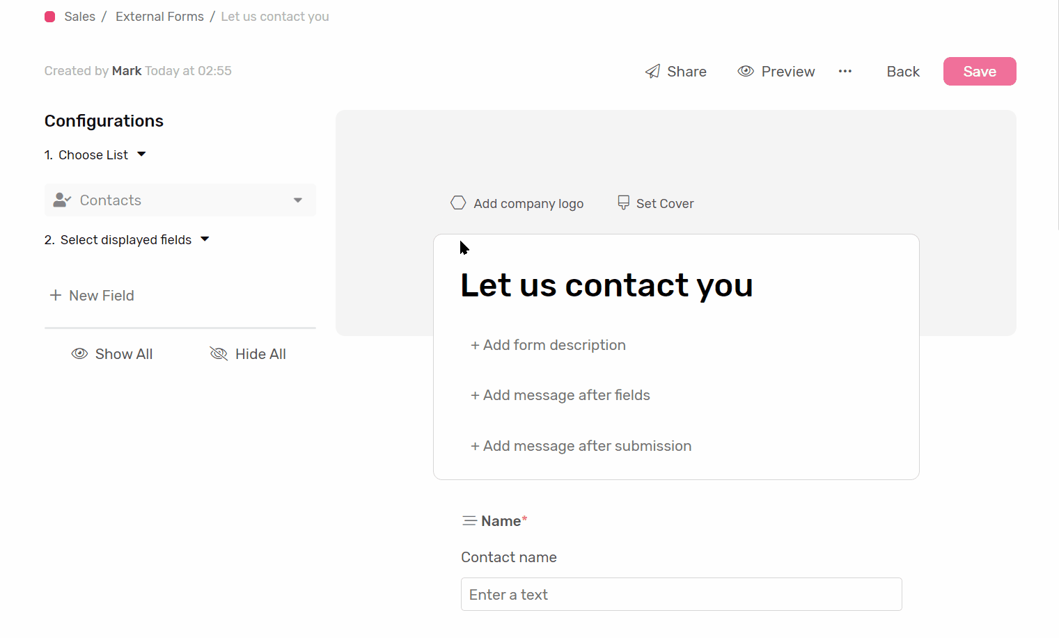
Form experience
- Form Name: This is the name of the form that will help differentiate it from other forms.
- Form Description: you can add a description to the form to help users filling it know what the form is used for and how to fill it out.
- Message After Fields: filling this field will show a message at the bottom of the form.
- After Submission Message: If you’d like to display a message to users after submitting the form, we recommend a “thank you!” message, or a “we will contact you soon”.
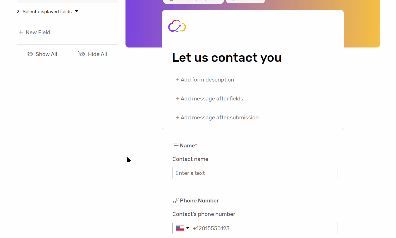
Fields options
Show / Hide
- Show All: to show all fields from the selected list under the form
- You can also show fields by clicking on the hidden field under the Select displayed fields.
- Hide All: to hide all fields from the selected under the form
- Hovering over any field displayed under the form will show you the hide button, click it to hide the field.
- Don’t forget to click save when you’re done.
Rearrange Fields
- Hover over the field you’d like to rearrange.
- Click and hold the drag handler
- Drag the field to its new position, and drop it.
- Repeat the process with other fields until you’re satisfied with the result.
Field Name
- You can change how the field name is displayed in the form
- This will not affect the field name in the list.
- We recommend using this feature to give your fields a more user-friendly name for the person submitting the form.
Field Description
- You can use this field to let the user know what kind of information is expected, or where they can get it from.
- The description will be displayed under the field in the form.
Default Value
- If you want the field to hold a certain value by default in case left empty by the user you can use this option to choose one.
- This will not affect any default value present in the field configuration in the selected list.
Placeholder
- The placeholder is a text that will appear within the field to show an example of the expected data or let the user know what is expected.
- The aim of the placeholder is to make the form experience as intuitive as possible

Required
- Enable this option if you want to make the field mandatory for submission.
- This will not affect the field configuration in the selected list.
Data Type Specific options
Linked List
- With linked list, you can choose a view filter.
- The filter will help limit the options the submitter can choose from.
Boolean
- You can have this field set checked by default
Fields that can’t be displayed in Forms
- Formula
- Auto Number
- Count
- Lookup
- Rollup
- User
Sharing the Form
Clicking share will present 2 options:
- Link: Simply share the link to receive submissions.
- Embed: this will give you an HTML code to embed on your website.