Bar Chart
A bar chart is a graph that uses rectangular bars to show the values of different groups. The length or height of each bar is proportional to the value it represents. Use them to group and compare your data sets.
Transcript
Creating a Bar Chart widget
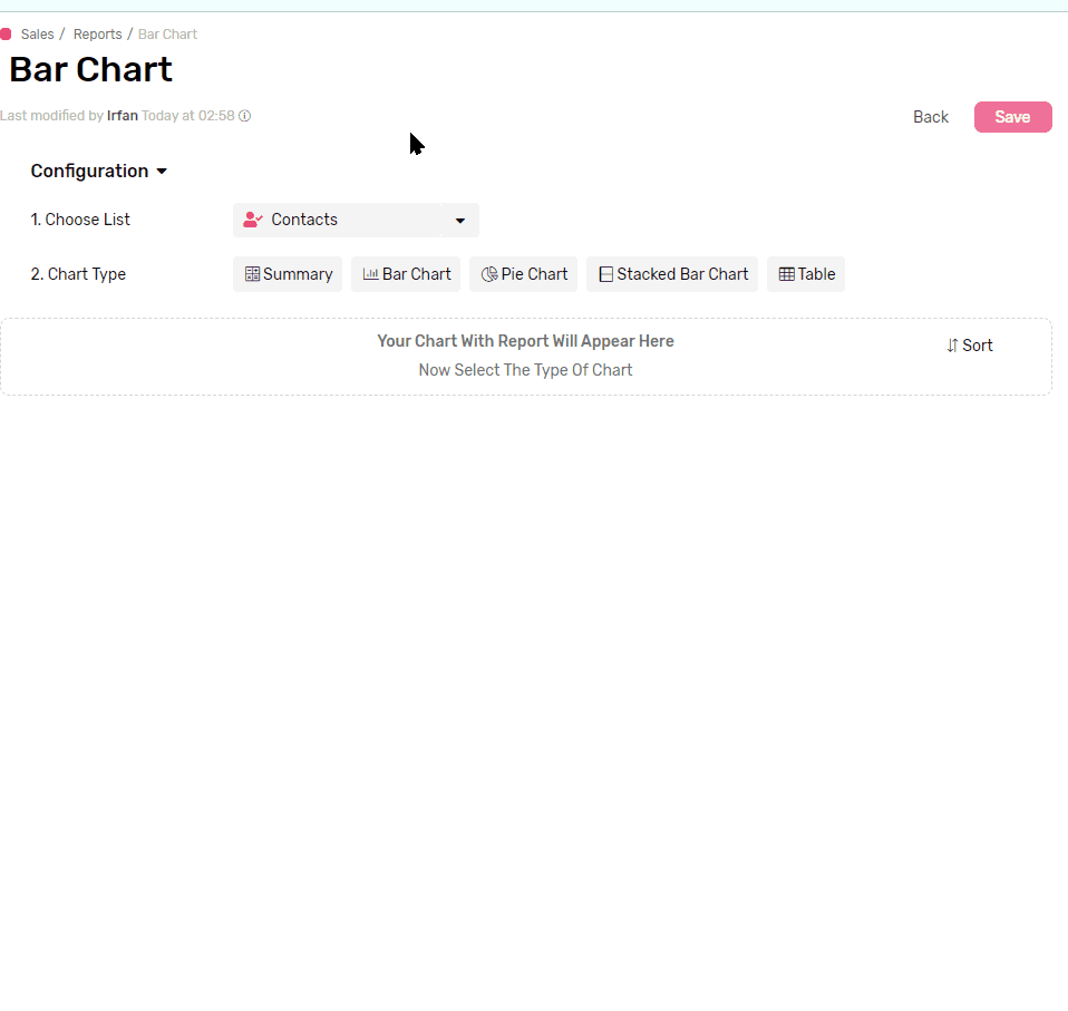
- Under any App, go to reports
- Click + Report
- Name your report
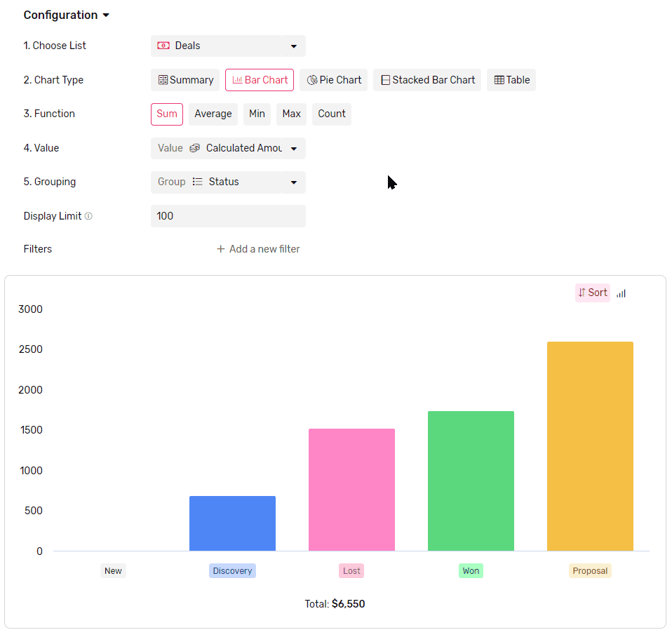
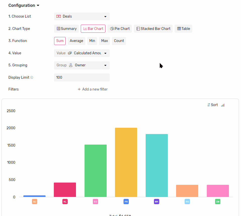
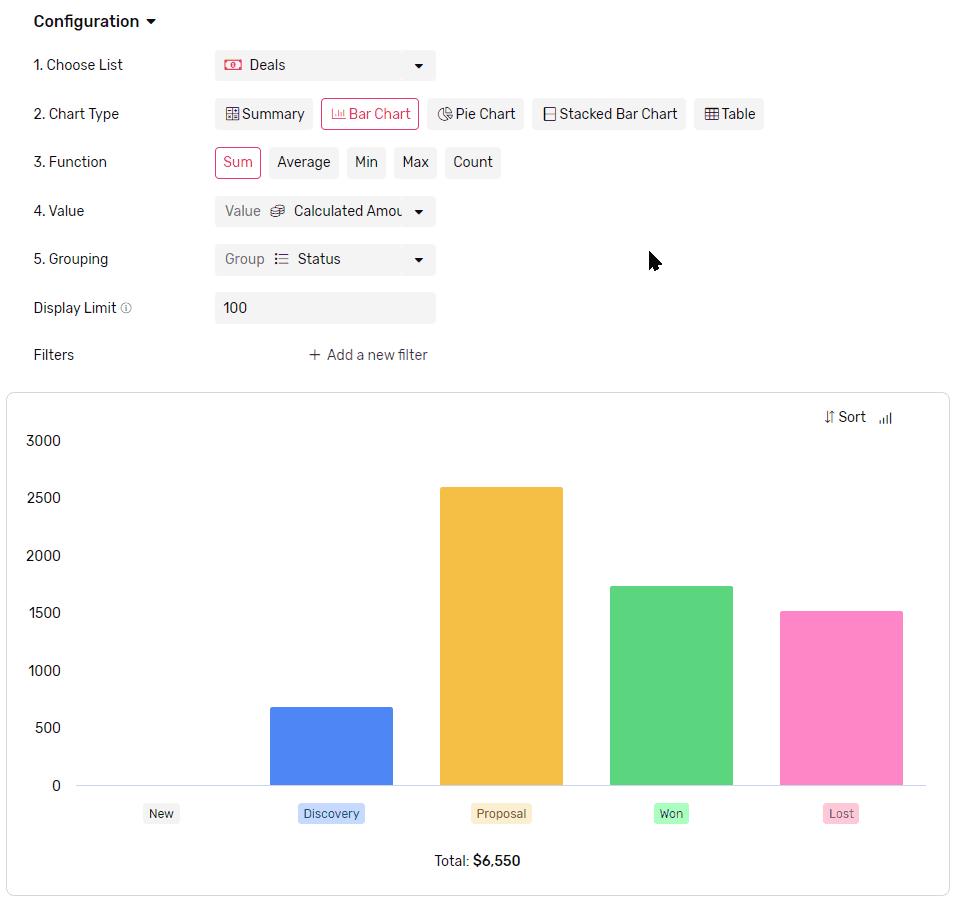
- Select the list you want to get the data from.
- From the Chart Type, select Bar Chart
- Then continue to configure it
Functions
Applying a mathematical function to all values in each group, e.g. get a total of all values, applying a filter later in the configuration will limit the function to work only on the values from records which match the filter.
- Sum will calculate the total of all values in each group.
- Average will calculate the mathematical average of all values in each group.
- Max will retrieve the Maximum value in each group
- Min will retrieve the Minimum value in each group
- Count will count the records which has a value in the selected field
- Count is the only function that accepts all types of fields.
Value
- This is where you select the field that you want the function to run on.
Grouping
- Select a field to group the data by, each group will be represented by a bar.
- If you group by a date field you can also set frequency
- Frequency can Daily, Weekly, Monthly or Yearly
- Each bar will represent a time frame determined by the frequency (e.g. if you select weekly, each bar will represent a week.)
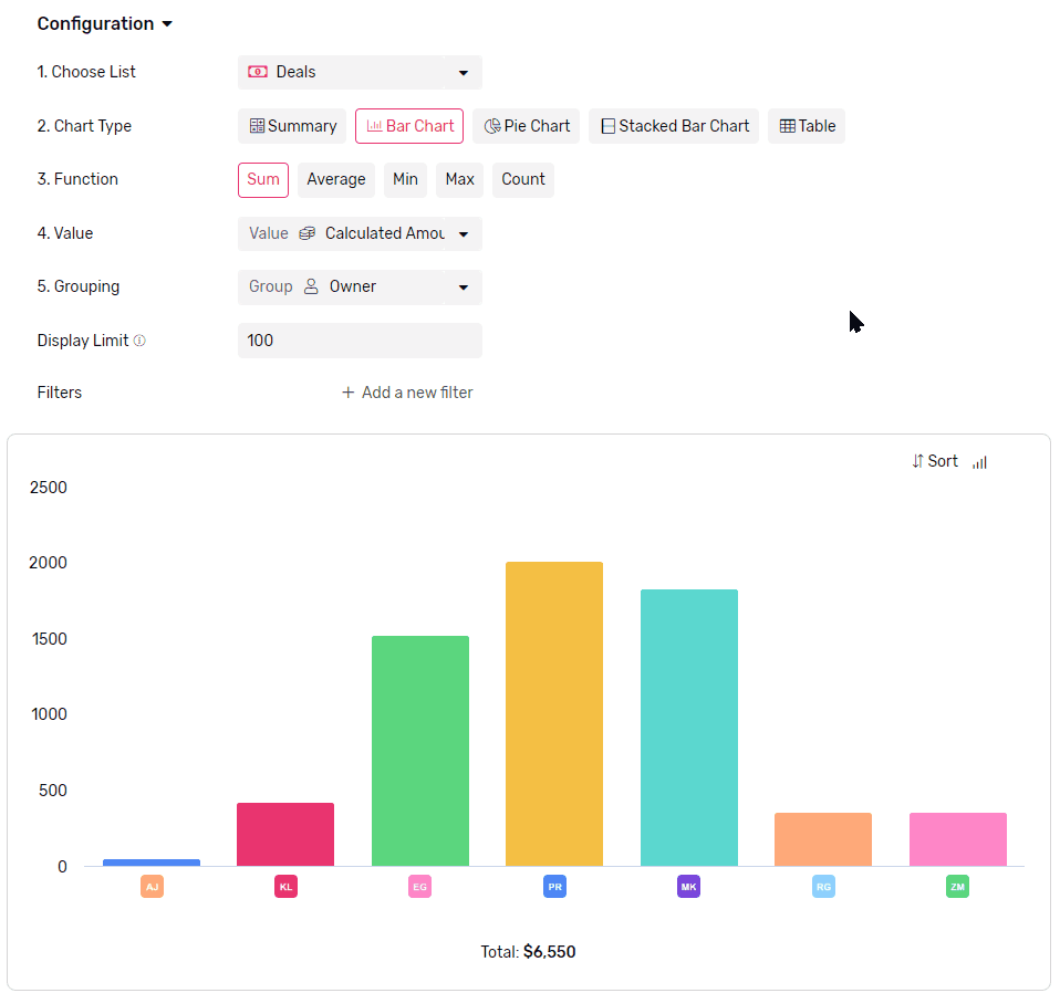
Display Limit
- Limit how many bars are displayed in the chart.
- The maximum number of bars you can see in the chart at a time is 100.
- If there are more groups than the limit the rest of the groups will be all gathered under one bar called others.
- To better control which bars are showing you can use a mix of Filters and Sorting.
Sorting
- You can sort your bars either by
- Value, which will sort based on comparing the value represented in the bars.
- Legend, which will sort based on groups labels.
Orientation
- You can display your bars vertically or horizontally by using this toggle at the top right corner of the graph.