


Line Chart
Compare how one or more values change across a grouping in a single chart.


The Line Chart shows how one or more values change across a grouping, such as months or statuses. Use it to spot trends and compare values side by side, alongside the other report chart types.
Note: Line Chart is labelled Beta in the Chart Type list, so details may change.
Chart Types at a Glance
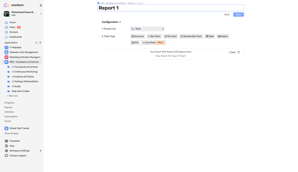
When you create a report, Chart Type offers: Summary, Bar Chart, Pie Chart, Stacked Bar Chart, Table, Gallery, Grid, and Line Chart (Beta). Select a type to see a preview of how it will look.
How to Create a Line Chart
1. Start a report
Open Reports and select + New Report. Under 1. Choose List, choose the list that holds your data.
2. Choose the chart type
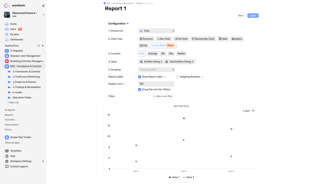
Under 2. Chart Type, select Line Chart. Before you choose any fields, the preview shows how the chart will look with sample data.
3. Choose the function
Under 3. Function, choose Sum, Average, Min, Max, Count, or Median.
4. Choose your values
Under 4. Value, select one or more fields in Value Field. Each field you select becomes its own line. The Value Field step isn't shown when you choose Count.
5. Choose the grouping
Under 5. Grouping, choose one Grouping Field. It sets the horizontal axis, for example Creation Date or Name. Only one grouping field can be selected.
6. Save the report
Select Save.
Expected result: The report shows a line for each value you selected. With two or more values, a legend under the chart shows which line is which.

Customize the Chart
Under Report Labels, choose:
- Show Report Label: show the value on the chart, so you don't have to hover. It is on by default.
- Wrapping Numbers: shorten large numbers, such as 1,000 as 1K.
You can also set a Display Limit (100 by default), keep Group the rest into "Others" on or off, and narrow the data with Filters (+ Add a new filter).
Line Chart or Bar Chart?
The Bar Chart also accepts more than one value. With two or more values it shows the bars side by side, with a legend. Both charts group by a single field. To split each bar by a second category, use a Stacked Bar Chart, which stacks the segments in each bar and shows a legend. There is no combined bar-and-line chart.


Use Cases
- Business use case: A sales manager plots Revenue and Target by month in a Line Chart to see where revenue rises, dips, or falls short of the target.
- Simple use case: You chart the number of tasks you complete each week.
💡 Tip: Turn on Show Report Label when you share a chart, so people can read the values without pointing to each point.
Need help? Reach out to our support team or check out the full guide for Bar Chart.