Table Chart
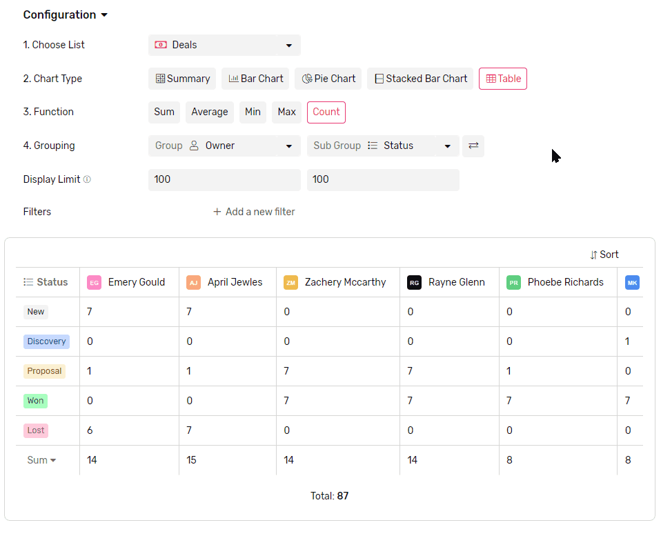
A table chart is a way of presenting data in rows and columns. It is used to group data in 2 groups and display the value corresponding to the intersection of both.
Transcript
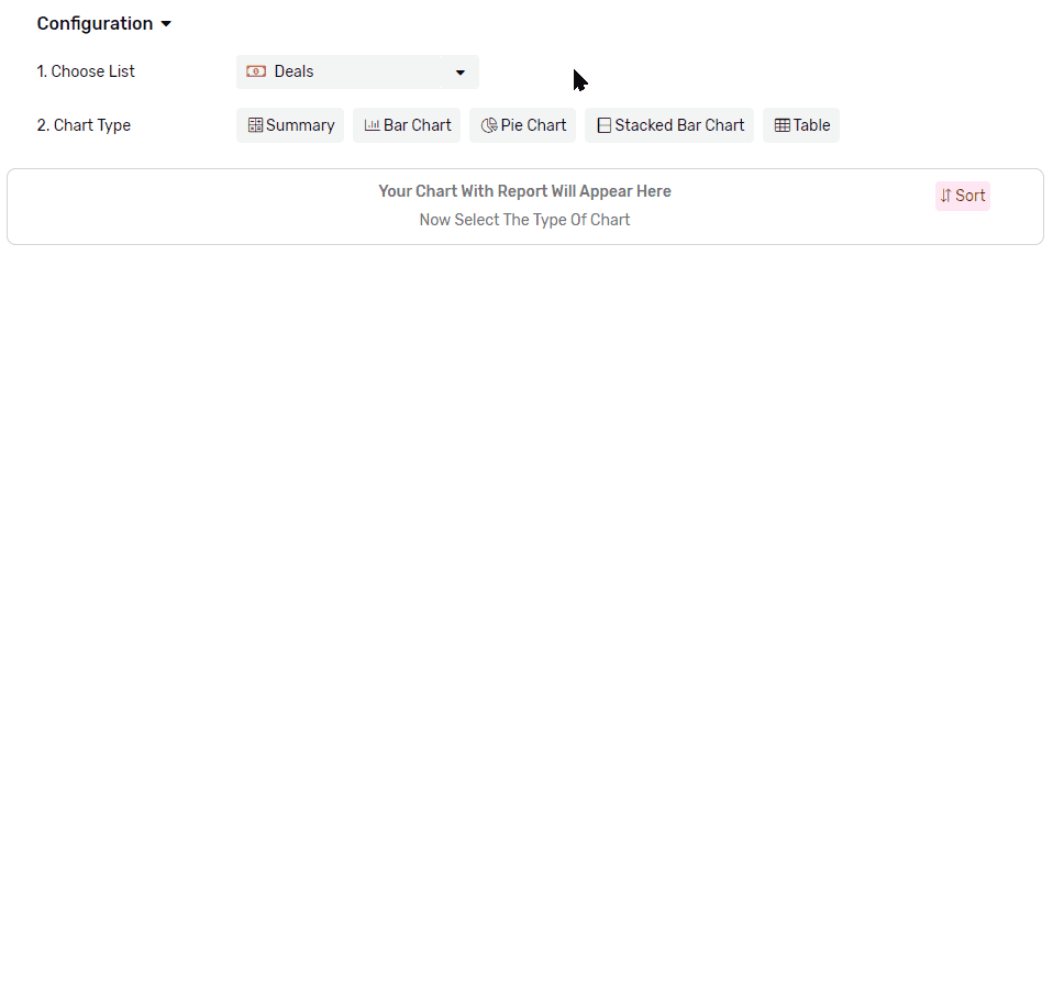
Creating a Table Chart widget
- Under any App, go to reports
- Click + Report
- Name your report
- Select the list you want to get the data from.
- From the Chart Type, select Table Chart
- Then continue to configure it
Functions
Applying a mathematical function to all values in each group, e.g. get a total of all values, applying a filter later in the configuration will limit the function to work only on the values from records that match the filter.
- Sum will calculate the total of all values in each group.
- Average will calculate the mathematical average of all values in each group.
- Max will retrieve the Maximum value in each group
- Min will retrieve the Minimum value in each group
- Count will count the records which have a value in the selected field
- Count is the only function that accepts all types of fields.
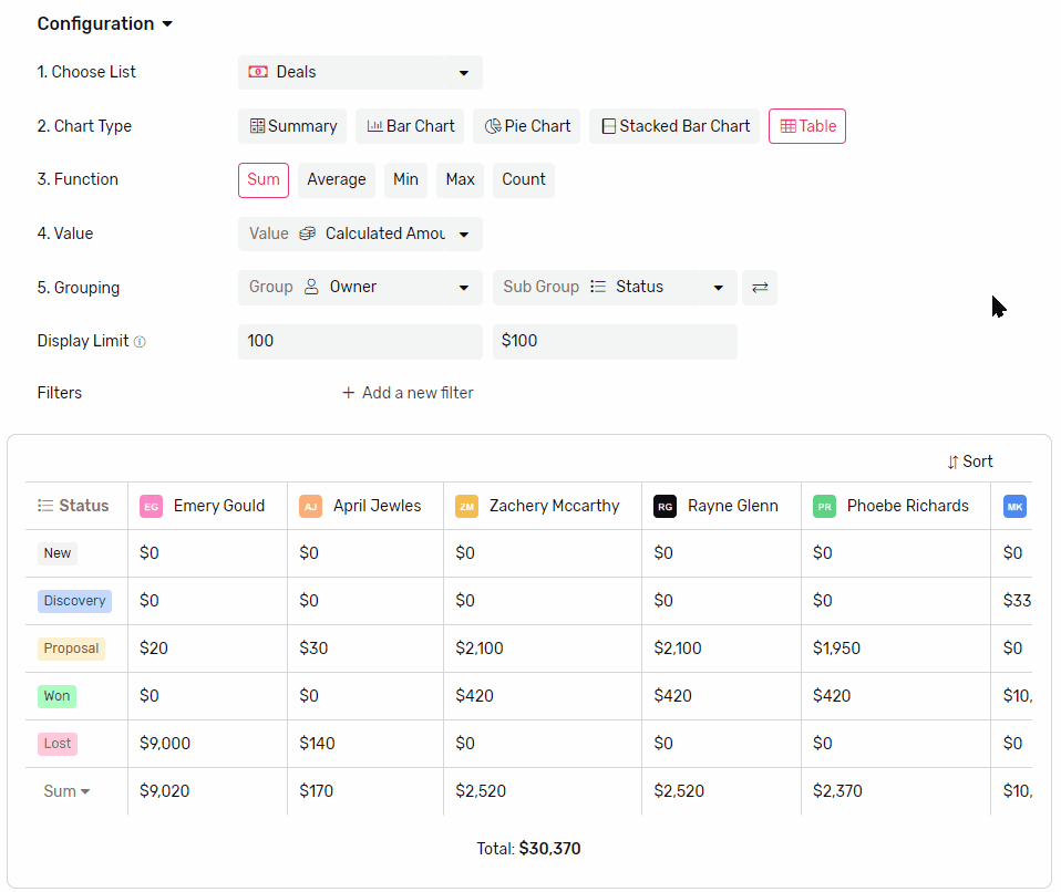
Value
- This is where you select the field that you want the function to run on.
Grouping
Main Group (Columns)
- This is the mandatory grouping field, that you can’t create a table without.

- Select a field to group the data by, each group will be represented by a column.
- If you group by a date field you can also set the frequency
- Frequency can be Daily, Weekly, Monthly, or Yearly
- Each column will represent a time frame determined by the frequency (e.g. if you select weekly, each column will represent a week.)
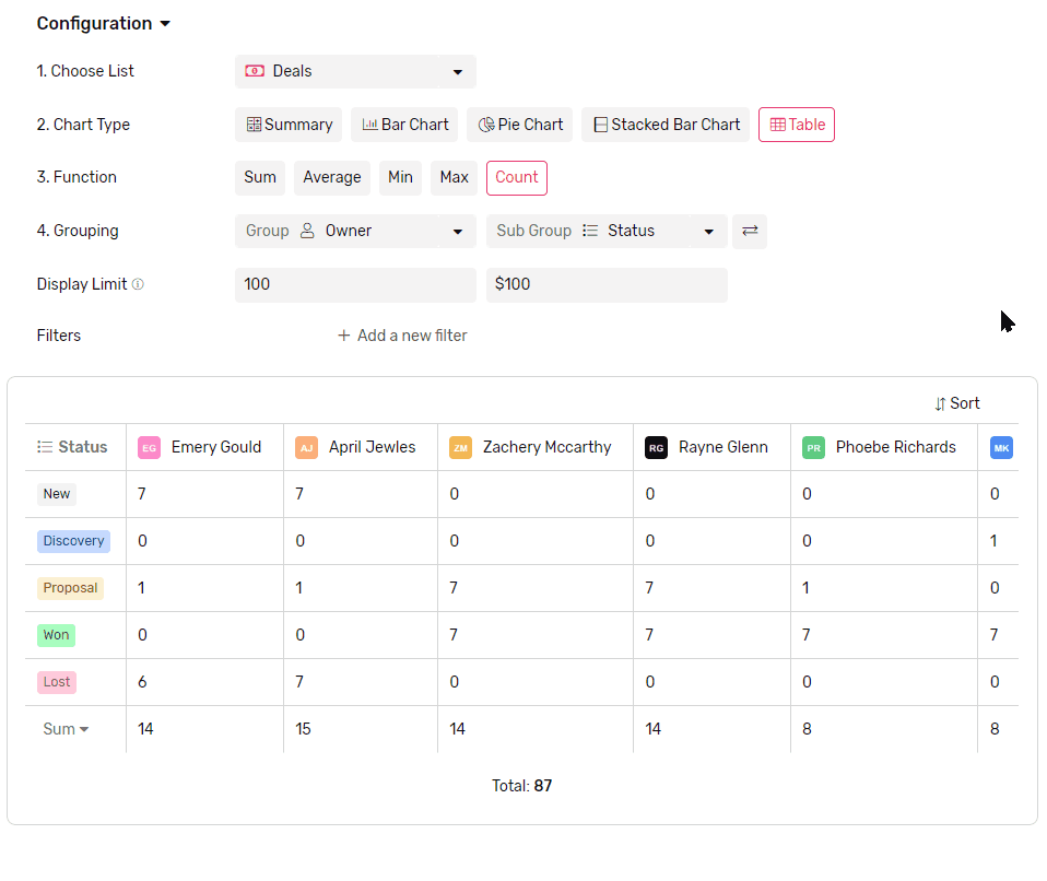
Secondary Group (Rows)
- If you select a secondary group, they will add rows to the table
- Each cell will represent the data that falls under both groups represented by the column and the row.
Switch grouping
- You can easily switch rows and columns by clicking the switch button right next to them.
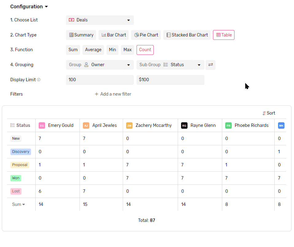
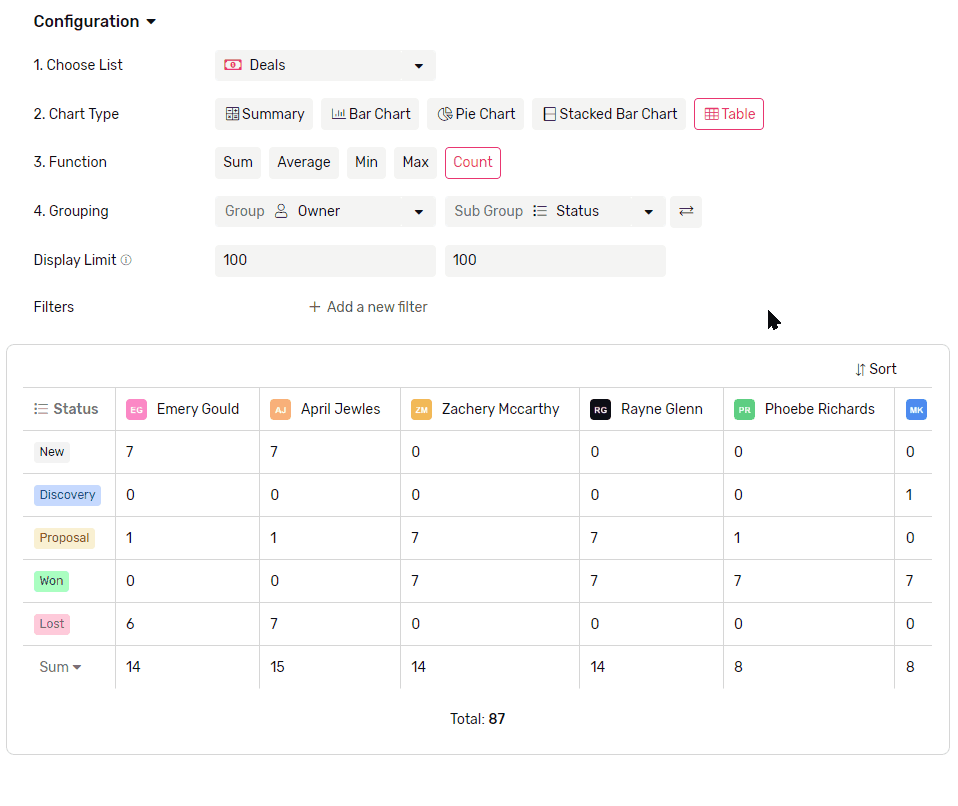
Display Limit
- Limit how many columns are displayed in the chart.
- The maximum number of columns you can see in the chart at a time is 100.
- If there are more groups than the limit the rest of the groups will be all gathered under one column called others.
- To better control which columns are showing you can use a mix of Filters and Sorting.
- The same applies to rows as well, with the sub-grouping limit.
Sorting
- You can sort your columns either by
- Value, which will sort based on comparing the value represented in the columns.
- Legend, which will sort based on columns’ labels.
- The same applies to rows.